Overview
In 2023, Denny’s set out to modernize its digital rewards system as part of its broader brand revitalization. The goal was to attract a younger, digitally savvy audience while maintaining loyalty from existing customers.
As the Lead UX designer on this project, I defined the user flows and experience strategy for the new Denny’s Rewards Challenge system, a gamified approach to earning discounts and perks.
Working closely with stakeholders, product managers, and the UI team, I designed UX flows and wireframes that would later be handed off for UI development.
Role
Lead UX Designer
Contribution
User Personas, User Flows, Wireframes, Cross-team collaboration
Timeline
4 weeks, 2023
Gamifying Denny’s Rewards
Designing a Reward System That Keeps Diners Coming Back
The Challenge
Denny’s had an existing offers system, but it lacked engagement, users would claim deals but had little incentive to return consistently. The new Rewards Challenge System aimed to:
Increase participation by making rewards feel more interactive and personalized.
Encourage repeat visits through progress tracking and milestone incentives.
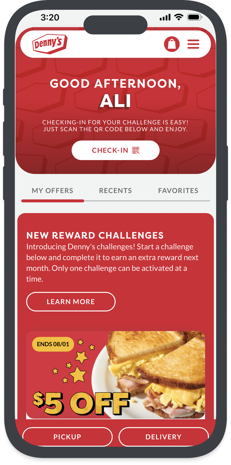
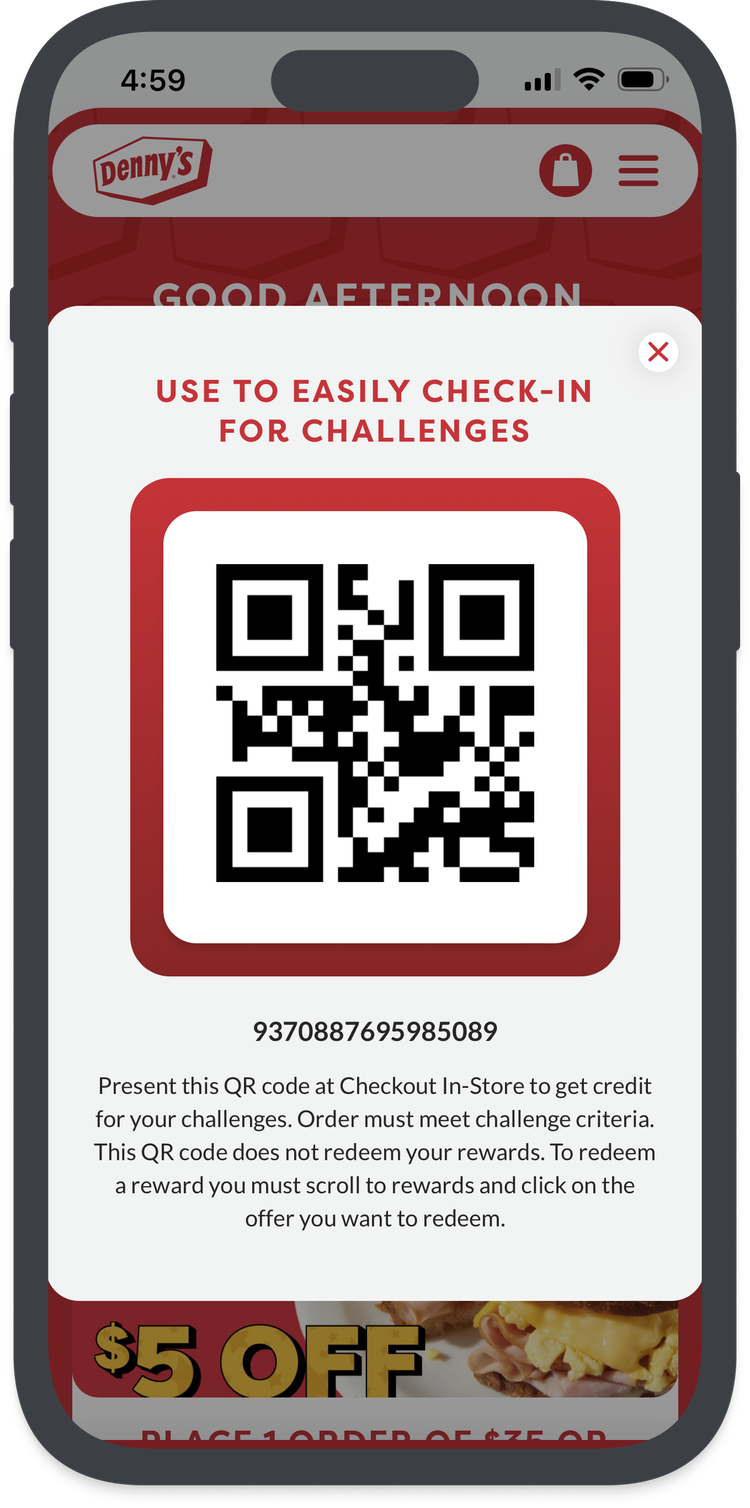
Create a seamless in-person & digital experience by allowing diners to check in at restaurants and track progress online.
How might we create a more engaging and seamless rewards experience that encourages participation, simplifies tracking, and drives repeat visits?
PROBLEM STATEMENT
Understanding the User
Because our stakeholders wanted to focus on attracting a younger audience while maintaining loyalty from existing customers, it was crucial to understand who the users are, why they engage with rewards, and where their pain points occur.
To ensure the new system resonated with both frequent diners and casual visitors, I conducted a short survey and user interviews to understand how different customer segments interact with rewards.
From this research, I identified two primary user personas:
The Loyal Denny’s Diner – A frequent visitor who values predictable, hassle-free rewards but prefers low-effort engagement.
The Casual Visitor – A younger, less frequent customer who engages with gamified, time-sensitive challenges and seeks instant gratification.
Defining the Strategy Moving Forward
Before the introduction of gamification and challenges, Denny’s Rewards functioned as a basic offers system, where users could redeem deals but had little incentive to engage beyond occasional discounts. While this system provided some value, it lacked the excitement and motivation needed to keep users actively participating and returning more frequently.
My research revealed four key pain points that prevented users from engaging with rewards effectively:
Lack of Visibility: Users forgot to check their rewards because they weren’t easily accessible.
Low Motivation to Engage: Without an interactive element, users didn’t see the benefit of participating regularly.
Unclear Progress & Incentives: Users had no way to track their activity, making rewards feel disconnected from their dining habits.
No Engagement Beyond Redemption: Once a reward was redeemed, there was no compelling reason to stay engaged until another offer appeared.
I aimed to transform the rewards system into something more engaging and habit-forming, my goals were:
Encourage Repeat Visits – By rewarding progress over time, rather than one-time redemptions.
Make Rewards More Fun & Interactive – Using gamification principles to keep users engaged.
Provide Clearer Tracking & Motivation – Ensuring users always know their progress and next steps.
Drive a Stronger Connection Between Visits & Rewards – Giving users a reason to check their app more frequently.
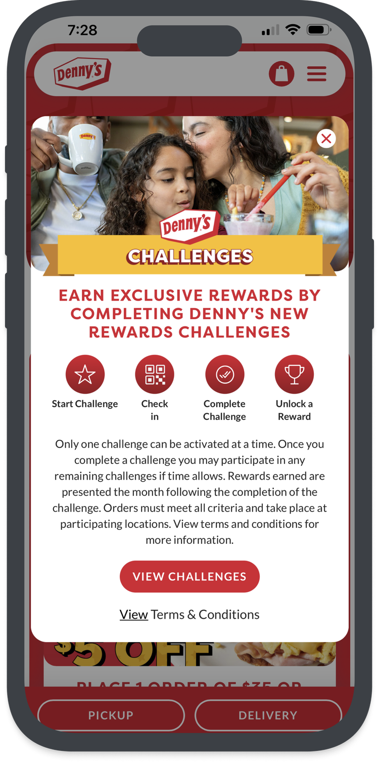
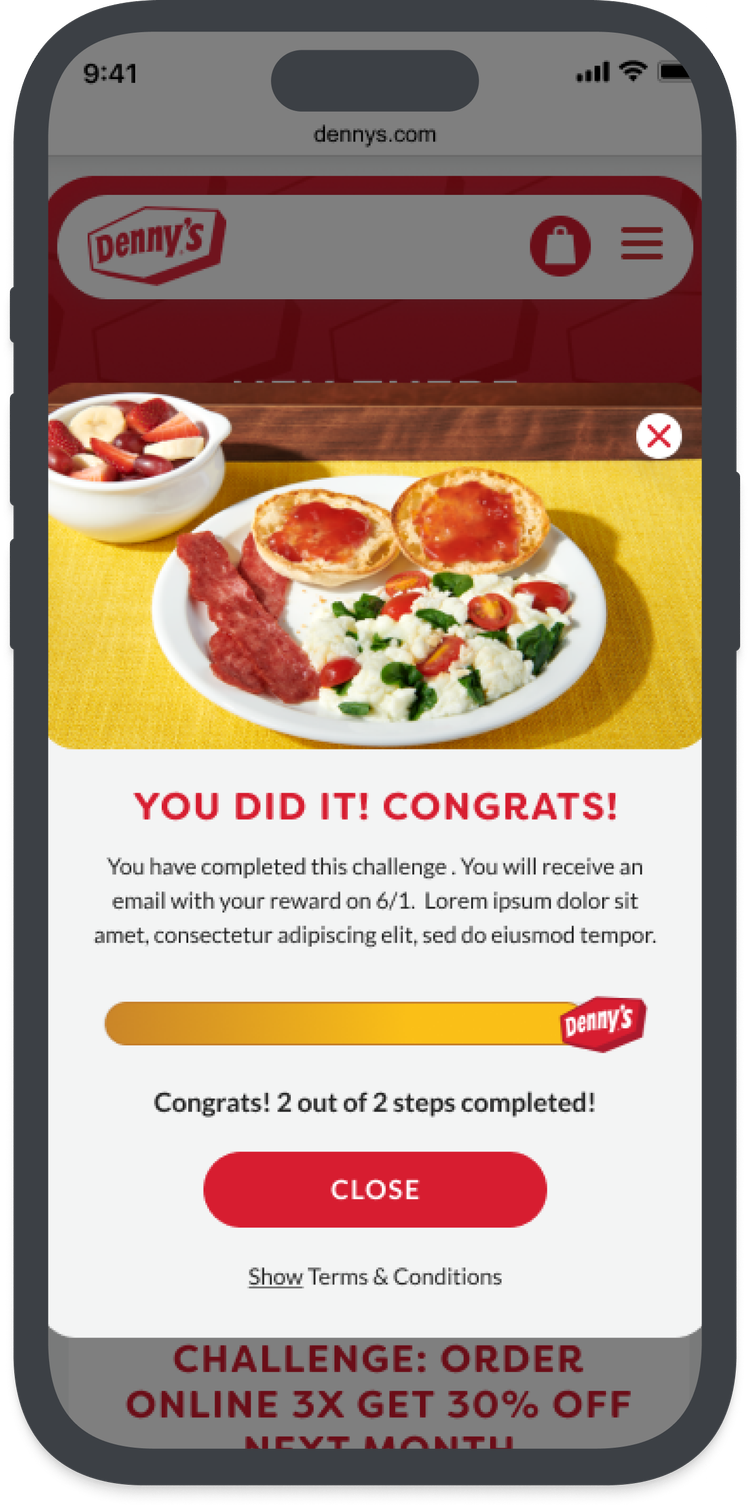
With these ideas in mind, I designed user flows that seamlessly integrated check-ins, challenge participation, progress tracking, and success/failure outcomes, creating a more dynamic and rewarding experience for both frequent diners and casual visitors.
Design Principles & Goals
Before jumping into visuals, I focused on defining clear UX goals based on user pain points, business objectives, and technical constraints. My strategy centered on creating an experience that would:
Encourage repeat visits by turning one-time offers into engaging, goal-oriented challenges
Minimize cognitive load by simplifying opt-in and progress tracking
Design mobile-first for on-the-go users
Use clarity over complexity, especially for casual users unfamiliar with Denny’s rewards
Create a modular, scalable system that UI and dev teams could reuse across offers and seasonal campaigns
Sketches & Wireframe Summary
To quickly explore layout and interaction ideas, I started with low-fidelity sketches to map out core flows:
Check-in CTA placement (persistent vs. contextual)
Challenge opt-in modal structure
Visual representations of challenge progress
What success and failure states would look like
From there, I translated key sketches into mid-fidelity wireframes to test logic and hierarchy. These wireframes were used internally to align with stakeholders and clarify technical needs. Though not shown here, they played a vital role in validating the UX before UI styling began.
Collaboration & Handoff
Once the UX wireframes were validated, I worked closely with the UI and dev teams to ensure smooth execution. As the only UX designer on the project, I:
Annotated wireframes with behaviors, edge cases, and logic
Participated in design QA to ensure final screens upheld UX intent
Communicated challenge logic, progress tracking, and failure states to developers
Provided clear UX documentation to reduce back-and-forth during implementation
Post-Launch Impact
Within three months of launching the redesigned rewards experience with challenge-based gamification, the app saw notable increases in both engagement and customer retention:
These results suggest that introducing challenge-based rewards not only made the program more fun and interactive, but also increased customer loyalty, app stickiness, and long-term participation.
Final Reflection
As the sole UX designer on this initiative, I led the experience design from early flows and wireframes through to stakeholder alignment and UI handoff. While I didn't own the visual design, I worked closely with the UI team to ensure our shared goals around clarity, simplicity, and engagement were upheld.
This project strengthened my belief in the power of well-executed UX strategy: by identifying real user pain points and crafting targeted, measurable solutions, we were able to evolve Denny’s rewards from a static offer system into a living, gamified ecosystem that resonates with both loyal diners and a new generation of customers.
If I were to continue this project, I would explore:
A/B testing multiple challenge types for different personas
Adding surprise “bonus” rewards for streaks or long-term engagement
Personalizing challenges based on user behavior


